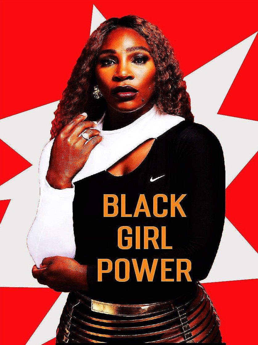
An expose on Serena Williams 23 Grand Slams in coordination with Nike. Introduced in my art direction class taught by Dana McMahan. we examined the aesthetic of Nike and the elements from Serena Williams Design Crew.
We started with logo designs. We also looked at the possibility of later connecting Micheals Jordans 23 with Serenas.
We definitely wanted to include the unique prints from the SWDC.
Here is another iteration of our groups logo. At this point in the process, we got a grasp on the simplicity that adds to the power and recognizability of Nike.
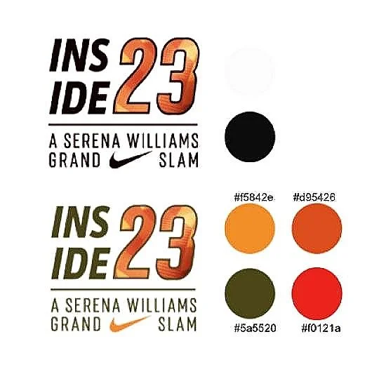
Our final logo and color palette. Using the style guide we would create our final designs for the installation.
I was assigned to design 8 cards for the deck of cards that would represent Serena from research. I used the color palette to find additional colors. The tennis ball green is a complement from the original red. Here is the final product:
